Optimising Infographics
for Annual Report Design
Utilise the engagement of infographics in your annual report designs with Wond Design. Discover how to effectively communicate complex information, engage readers, and make a lasting impact.
Annual reports are a vital communication tool for businesses, used to showcase their financial performance and achievements to stakeholders and investors. However, with the abundance of data and information included in these reports, it can be challenging to create designs that are visually appealing and engaging for readers. Infographics have become a popular solution for presenting complex information in a clear and concise manner, making it easier for readers to understand and engage with the content. In this article, we will explore the benefits of using infographics effectively in annual report designs and share tips on how to create designs that create the most impact and engagement with readers.
1. Introduction to Different Types of Charts and Forms of Data Visualisation for Annual Report Design
Annual reports are a critical communication tool for businesses to showcase their financial performance and achievements to stakeholders and investors. These reports are typically dense with data and information that can be overwhelming for readers. One effective way to make this information more accessible is by using infographics. Infographics can highlight key content and data points in a clear and visually appealing manner, making it easier for readers to understand and engage with the content. Annual report designers can benefit from working with an infographic design agency, or a graphic design agency with expertise in creating impactful infographics. In this article, we will explore different types of infographics that can be used in an annual report design to highlight key content and data points.
Bar Charts
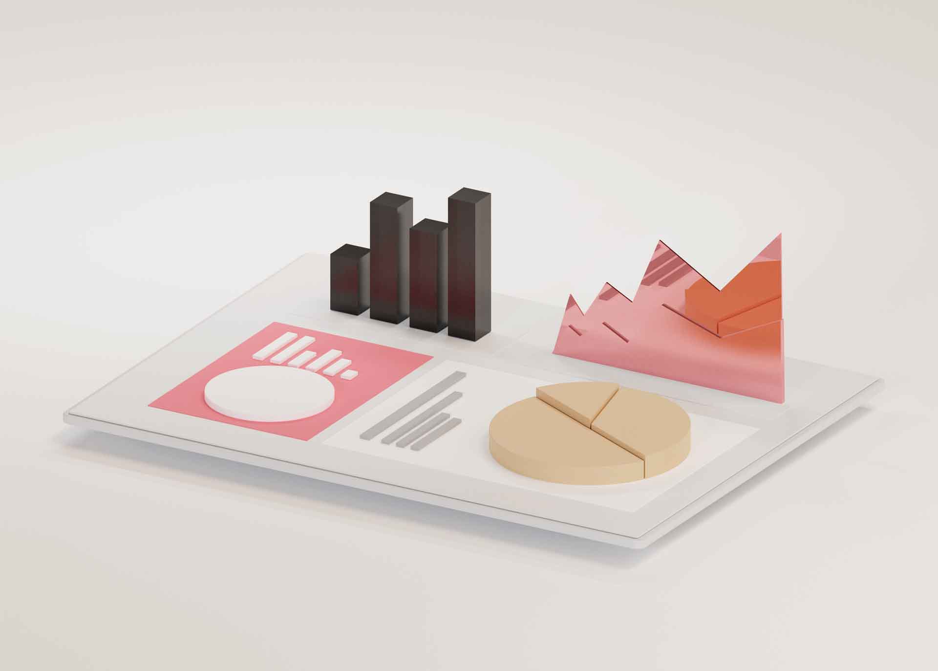
Bar charts are one of the most common types of infographics used in annual reports. They are effective at comparing data points and presenting numerical data in an easy-to-understand format. Bar charts can be used to show financial performance over time or to compare revenue streams between different departments or products.
Line Graphs
Line graphs are useful for showing trends over time, making them ideal for illustrating changes in revenue, profits, or other key metrics. Graphic designers can create line graphs that use colour to highlight different trends or to distinguish between different departments or products.
Pie Charts
Pie charts are an effective way to show the breakdown of data into different categories. They are particularly useful for presenting data related to market share, revenue streams, or expenses. Graphic design agencies can create pie charts that use colour to differentiate between categories and make the data more visually appealing.
Infographic Timelines
Infographic timelines are useful for presenting data related to business growth or product development over time. They can be used to show significant milestones, such as the launch of a new product, or to chart the progress of a project or initiative.
Flowcharts
Flowcharts are ideal for presenting complex processes or decision-making pathways in a clear and easy-to-understand format. They are particularly useful for presenting information related to supply chains, project management, or decision-making processes.
Heat Maps
Heat maps are a visual representation of data that show the concentration or distribution of data points. They are useful for showing patterns, trends or correlations between variables. Heat maps are often used to represent data related to geographic regions, such as sales or customer locations.
Radial Charts
Radial charts are a type of infographic that uses a circular format to present data. They are effective for displaying data that has a cyclical or periodic nature, such as seasonal sales trends. Radial charts can also be used to represent data related to market share, with each segment representing a different product or service.
Tree Maps
Tree maps are a type of infographic that uses a hierarchical format to present data. They are effective for showing the relationship between different data points and the relative size of each data point. Tree maps can be used to represent data related to market share, revenue, expenses, or project management.
Word Clouds
Word clouds are a type of infographic that uses a visual representation of words to show the frequency of occurrence. They are effective for representing data related to customer feedback, customer reviews, or social media sentiment. Word clouds can be designed to use different colours or font sizes to emphasise certain words or themes.
Venn Diagrams
Venn diagrams are a type of infographic that uses overlapping circles to represent the relationship between different data points. They are effective for showing the intersection or overlap between different variables, such as customer demographics, product features or marketing channels. Venn diagrams can be designed to use different colours or shapes to emphasise different variables.
Infographics are essential
In conclusion, infographics are an essential tool for creating effective annual report designs that communicate important information in a visually appealing and engaging way. By working with an infographic design agency or graphic design agency, annual report designers can create a range of infographics that highlight key content and data points. By choosing the right type of infographic, businesses can create annual reports that are more accessible and engaging for readers, and that effectively showcase their financial performance and achievements.
2. How to use infographics intelligently in an annual report design to create the most Impact and engagement with readers
Annual reports are an essential tool for businesses to communicate their financial performance and achievements to stakeholders, investors, and the wider public. While annual reports typically contain large amounts of complex data and information, they don’t have to be dull and difficult to digest. By using infographics intelligently, annual reports can become more engaging, visually appealing, and effective in communicating important information. Here are some tips on how to use infographics intelligently in an annual report design to create the most impact and engagement with readers.
Determine the purpose of the infographic
Before creating an infographic, it’s important to determine the purpose it will serve. Infographics can be used to illustrate a variety of data, including financial performance, market trends, and business growth. Knowing the purpose of the infographic will help determine the type of data that needs to be highlighted and the design that will be most effective.
Keep it simple
Infographics are meant to simplify complex data, not make it more complicated. Keep the design simple and easy to understand. Avoid using too many colors or complicated graphics that may confuse or overwhelm readers. A clean and simple design is more likely to be effective in communicating important information.
Highlight key data points
The goal of an infographic is to highlight key data points in a clear and visually appealing manner. Identify the most important data points that need to be communicated and make them the focus of the design. This will help readers quickly understand the most important information without being overwhelmed by too much data.
Use the right type of infographic
Different types of infographics can be used to communicate different types of data. For example, bar charts can be used to compare data points, while line graphs can be used to show trends over time. Choose the type of infographic that best communicates the data being presented.
Incorporate branding elements
Annual reports are an opportunity to showcase a company’s brand and values. Incorporate branding elements, such as company colors and logos, into the design of the infographic. This will help reinforce the company’s brand and create a consistent look and feel across all communication channels.
Keep it on brand
While it’s important to incorporate branding elements, it’s also essential to keep the design on brand. The infographic should reflect the company’s values and mission while also communicating important data. A design that is consistent with the company’s brand will be more effective in communicating the message.
Tell a story
Infographics can be used to tell a story about a company’s financial performance and achievements. By highlighting key metrics and trends, infographics can create a narrative that guides the reader through the report. This storytelling approach can make the information more engaging and memorable.
Conclusion
In conclusion, infographics are a valuable tool for creating effective annual report designs that communicate important information in an engaging and visually appealing way. By keeping the design simple, highlighting key data points, and incorporating branding elements, businesses can create infographics that communicate important information while also reinforcing their brand identity. By telling a story through the infographic, businesses can create a more engaging and memorable annual report that resonates with readers.
Expert Design, Excellent Results.
Contact us now to discuss your project.
3. Why infographics are essential to quality annual report design
An annual report is a comprehensive document that communicates a company’s financial performance to its shareholders, stakeholders, and other interested parties. It is an essential tool for corporate communication, and its design plays a critical role in how effectively the information is conveyed. In today’s information age, attention spans are shorter, and visual communication is more critical than ever. Infographics have become an essential component of annual report design because they can effectively communicate complex information in a visually appealing way.
Infographics are visual representations of information or data, and they can be used to illustrate trends, relationships, and comparisons. They are an ideal tool for annual reports because they can help to distill complex financial data into a clear, easy-to-understand format. Here are some of the benefits of using infographics effectively in annual report design:
Visual Appeal
Infographics can transform dry, boring data into engaging, visually appealing content. They use colors, shapes, and images to make information more attractive and memorable. Infographics can also break up long blocks of text and create a more dynamic design that draws the reader’s eye.
Clarity
Annual reports contain a lot of data, and it can be challenging to present it in a clear, concise way. Infographics can help to simplify complex information and make it more accessible. By using graphs, charts, and diagrams, infographics can make it easier for readers to understand financial information and the relationships between different elements.
Storytelling
Infographics can help to tell a story about a company’s financial performance. By highlighting key metrics and trends, infographics can create a narrative that guides the reader through the report. This storytelling approach can make the information more engaging and memorable.
Shareability
Infographics are highly shareable on social media and other digital platforms. By creating infographics that highlight key points from the annual report, companies can amplify their message and reach a wider audience. Infographics can also drive traffic to the company’s website and increase brand awareness.
Branding
Infographics can be designed to reflect a company’s brand and visual identity. By incorporating company colors, logos, and other visual elements, infographics can reinforce the company’s brand and create a consistent look and feel across all communication channels.
Conclusion
In conclusion, infographics are a valuable tool for effective annual report design. They can help to make complex financial information more accessible, engaging, and memorable. By using infographics effectively, companies can create a more compelling annual report that tells a story, reinforces their brand, and reaches a wider audience.


